
SOLUTION
SEAFARER WEBSITE AND APP CONCEPTION
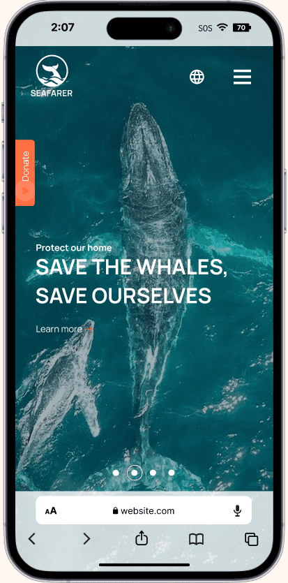
Design a responsive website that would make education on the topic of whale conservation stimulating and easily accessible, and also, seamlessly guide users through how to donate to the cause.

PROCESS
PAIN POINTS
I used data on whale conservancy to develop interview questions, which were then used to conduct user interviews.
Results showed that most participants reported not knowing about how whale populations were affected through industrial and illegal fishing and feeling badly about declining whale population after finding out. However, they didn’t actively try to find ways to engage with the topic further due to a lack of stimulating educational resources, information overload, and a lack of personal time.
There is a disconnect in how helping whales impacts people's livelihoods, so how might we get users to care and engage with whale conservation, and how might we empower the user to FEEL like they're making a difference?
1
EDUCATION
Users need easy-to-access means of educating themselves on the subject of whale conservancy and on how they can help
2
TIME
Users need fast and easy means of educating themselves and on guiding and educating others on the subject of whale conservation and on how they can help
MEET THE USERS
Using the answers and data from the interviews and competitive audit, I created a persona reflective of our typical user, to better empathize with them. From interviews, I noticed two commonalities: individuals need to be able to connect more emotionally and want to know how to best focus their efforts.


COMPETITIVE ANALYSIS
I looked at 10+ indirect and direct competitors’ websites in comparison to Seafarer, including other whale conservancies and aquariums. I noticed while features between competitors were very similar, the main differences that were noticed were:
Easily Accessible vs Hardly Accessible
Cluttered Display of Information vs Simple Display of Information
Loud/Distracting Interface vs Minimalist Interface


LOW-FIDELITY PROTOTYPE
To prepare for usability testing, I created a low-fidelity prototype that connected the user flow of donating through the Seafarer mobile website.

PARAMETERS


FINDINGS

1
Ways to donate
People want easy access to more ways to donate to whale conservation

2
Educational sections
People wanted more sections on whale conservation education/news, scrollable on the home page
3
Language
People needed a way to educate themselves in their own languages
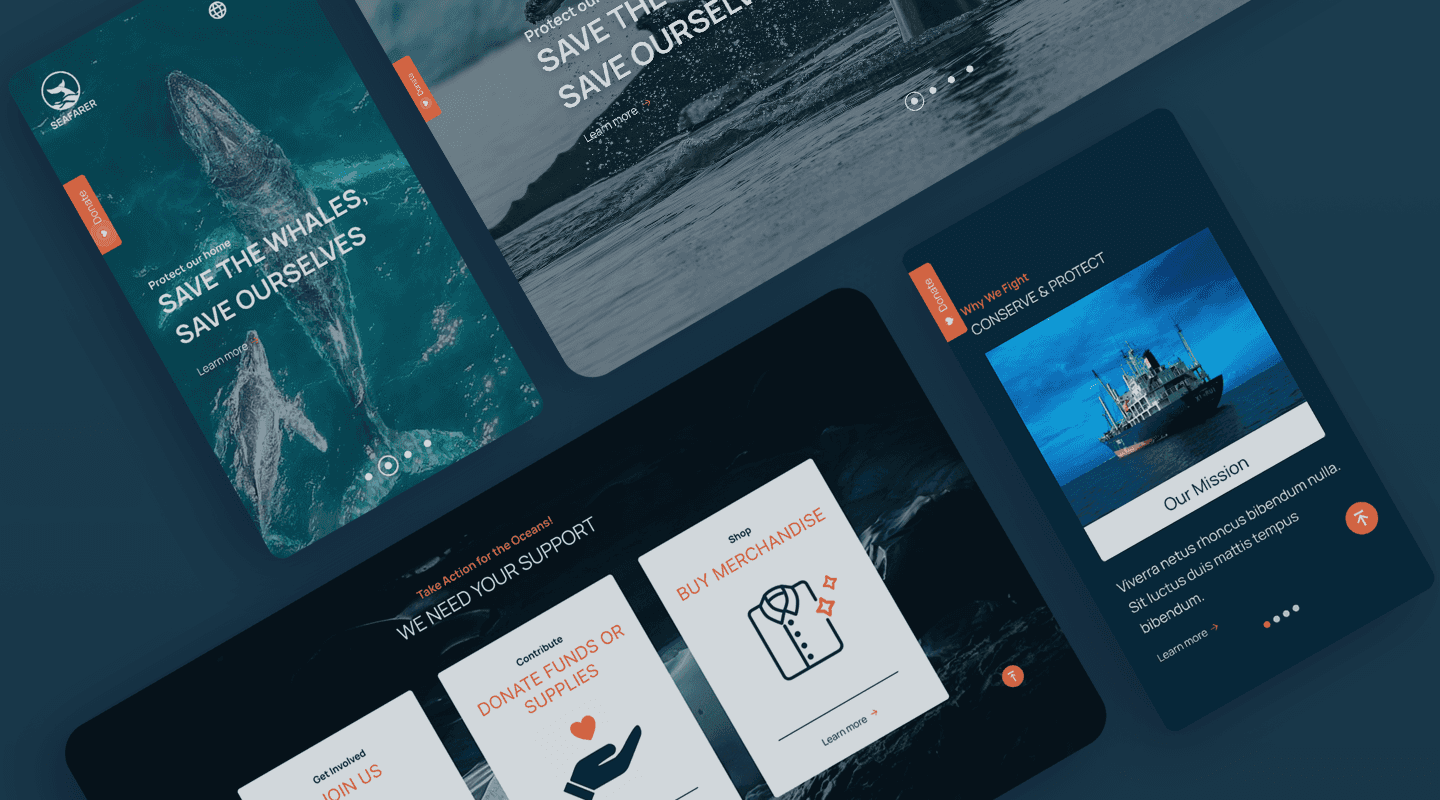
HIGH-FIDELITY MOCKUPS
The high-fidelity prototype followed the same user flow as the low-fidelity prototype, including design changes made after the usability study.
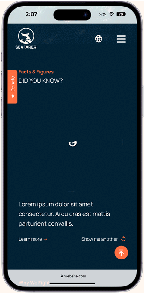


ACCESSIBILITY CONSIDERATIONS

1
Alternative Text
Clear labels for interactive elements that can be read by screen readers

2
Language
Inclusion of the globe icon for a language menu, translating the website into different languages for non-English speakers
HIGH-FIDELITY PROTOTYPE
REFLECTIONS
TAILORED UNDERSTANDING
You need to have a deep understanding of your users and develop tailored solutions for them. In order to have meaningful engagement in this field, you need to tap into people's humanities and bring in emotion as part of the experience.
PRIORITIZATION
When dealing with an overwhelming amount of routes you can go in, you've got to be able to be agile and prioritize to respond to the situation quickly. Otherwise, you risk missing out on reaching the right person at the right time.

But enough about me,
tell me about you!